The light color of light sources
Light color, the color of the light source, and color-rendering properties, which are the characteristics of the illumination light that affect the way the color of an object is seen, change according to the proportion or ratio of the composition of the components of each wavelength of each ray of light emitted by the light source. Light color affects the ambience of a space, and color-rendering properties affect how the color of an object is seen. For this reason, one must give full consideration to not only the luminance level and brightness distribution but also light color and color-rendering properties in order to create a comfortable lighting environment.
1. Color temperature
When the light source is lit, its light color may have either a blue or yellow tint. This is called the light color of the light source (light source color). The light source color can be objectively expressed as the color temperature. Light source colors are broadly divided into white light and colored light; however, the concept of color temperature can only be applied to white light. It is not possible to determine the color temperature of colored light.
“White light” refers not to the color of the light source itself, the light source color appears white or has a yellowish tinge, but rather to the light source colors that contain almost the full range of the light that humans can see (visible light). White light sources containing these types of light colors are called white light sources, and virtually all light sources used in general lighting are white light sources. For example, daylight fluorescent lamps have light colors tinged with blue, while incandescent light bulbs have light colors tinged with yellow, but they both contain the full range of visible light and are, therefore, both white light sources.
In contrast to white light, light source colors that only emit a specific color are known as colored light sources, and light sources that contain these types of light colors are called colored light sources.
White light sources are characterized by the fact that after the light source has been illuminating a room for more than a certain amount of time, the light will appear nearly white, regardless of whether the light source emits light color with a bluish tinge or a yellowish tinge. This phenomenon, called color adaptation, results from a function of human eyes that works to adjust light source colors so that they appear white.
If the white light source color is expressed by a subjective degree of whiteness, it is an extremely inaccurate method of expression because of the existence of the color adaption phenomenon. A physical and objective measurement scale is therefore required, and the objective measurement scale used for this purpose is the color temperature.
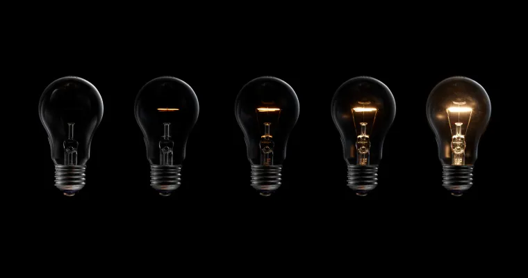
The color temperature of a light source is defined as follows: when an object that is physically defined as pitch black (called a “black body”) is heated from the outside and the temperature rises, the color of the object gradually changes from black to dark red, then from dark red to red, red to pale pink, pale pink to yellow, yellow to orange, orange to white, and white-blue color. When the light color of the black body is equivalent to the light color that the light source appears to be, the absolute temperature of the black body (K: kelvin) is expressed as the color temperature of the light source. Accordingly, the light source with a low color temperature means that its light color will tend towards a reddish tinge, while a light source with a high color temperature means that the light source color will tend towards a bluish tinge.
Generally, light sources with a temperature of around 3,000 K or less will have a slightly reddish light color, while light sources with a temperature of around 7,000 K or more will have a slightly bluish light color.
Furthermore, light color classifications are prescribed under the Japanese Industrial Standards (JIS). Under these standards, light colors are divided into five categories: light bulb color, warm white, white, daylight white, and daylight color.
2. Color temperature and correlated color temperature
Both the color temperature and the correlated color temperature have basically the same concept; strictly speaking, they have different meanings. “Color temperature” is used when the chromaticity of the light source is equivalent to the chromaticity of the black body being used as the standard (Planckian radiator). In contrast, “correlated color temperature” is used when the chromaticity of the light source is not on the Planckian locus. Because the chromaticity of the light sources used for general lighting is often not on the Planckian locus, the measurement scale for their light source color is technically expressed as the correlated color temperature, not simply the color temperature. Table 1 shows the correlated color temperatures and color rendering indexes (discussed below) of representative light sources.
A point to note regarding color temperature is that even if the light sources have the same color temperature (the same correlated color temperature), their light colors may appear different. For example, when the chromaticities of the light sources are above and below the Planckian locus, the light sources will both have the same correlated color temperature; however, they will have different light colors.
When the chromaticity of the light source is above the Planckian locus, the light source color will generally appear slightly greenish. In contrast, when the chromaticity of the light source is below the Planckian locus, the light color will be slightly reddish. The further away from the Planckian locus the chromaticity of the light source is, the stronger the green or red tinge of the light color becomes.
Table 1: List of color temperatures and color rendering indexes by light source (guidelines) as of March 2019
| Light source (product name) | Color temperature (K) | Average color rendering index (Ra) | Special color rendering index | |||||
|---|---|---|---|---|---|---|---|---|
| R9 (red) | R10 (yellow) | R11 (green) | R12 (blue) | R13 | R14 | |||
| LED light bulbs | 6500 | 84 | 19 | 75 | 84 | 61 | 86 | 96 |
| 5000 | 84 | 21 | 78 | 85 | 67 | 86 | 97 | |
| 2700 | 84 | 9 | 84 | 81 | 79 | 85 | 98 | |
| LED lighting fixture | 6500 | 83 | 9 | 68 | 82 | 56 | 83 | 94 |
| 5000 | 83 | 2 | 70 | 82 | 57 | 83 | 96 | |
| 4000 | 83 | 12 | 71 | 79 | 58 | 83 | 96 | |
| 3500 | 83 | 15 | 79 | 79 | 64 | 85 | 98 | |
| 3000 | 83 | 10 | 71 | 81 | 67 | 81 | 96 | |
| 5000 | 95 | 90 | 93 | 88 | 81 | 99 | 96 | |
*Figures are rough estimates, and the values shown are not guaranteed.
3. Psychological effects of light color
(1) Light color and sense of warmth/coolness
Although the relationship between light color and the perception of warmth or coolness (sensation of warmness or coolness) is not necessarily constant because of differences arising from differences between individuals, regions, and seasons, the relationship between the correlated color temperature and the perception of warmth or coolness has been set forth as follows under the JIS [1]. That is to say, a light source with a correlated color temperature of 5,300 K or higher provides the perception of coolness, while conversely a light source with a correlated color temperature of 3,300 K or lower provides the perception of warmth, and a light source with a correlated color temperature of between 5,300 K and 3,300 K provides a perception between warm and cool.
(2) Level of light color/Illuminance and atmosphere
In 1941, Kruithof published the results of research on the psychological effects of the color temperatures of light sources on people in rooms illuminated by these light sources [3].
a. Rooms illuminated using light sources with a low color temperature have a warm atmosphere with a calming effect, and light sources with a low color temperature are appropriate for lighting with comparatively low Illuminance.
b. Rooms illuminated by light sources with a high color temperature have a slightly cold and gloomy atmosphere when the Illuminance is low. Light sources with a high color temperature are appropriate for lighting with comparatively high Illuminance, and lighting that uses this type of light source creates a comfortable atmosphere even with a high illuminance of several thousand lux.
However, the light sources used in Kruithof's experiment were light bulbs in the low color temperature field and low color-rendering fluorescent lamps in the high color temperature field; therefore, problems with the experimental method, such as changes occurring simultaneously in not only the color temperature but also color-rendering and light diffusion (modeling), have been pointed out [4].
Another problem is that the report does not specify whether or not the effect of color adaption was even considered. Furthermore, other research found that Kruithof's results could not be replicated within certain Illuminance and color temperature ranges [4,5].
When spending a long time in a room illuminated by the same light color, the eyes of the people in the room come to see the light source color as white because of color adaption, regardless of the color temperature, and so naturally the aforementioned psychological effects of the light color are diminished. Accordingly, these psychological effects do not necessarily occur all of the time. Under the following conditions, however, the light color sometimes exert a strong psychological effect.
1. When a person has been in a room illuminated by a certain light source for a long time and they then enter another room illuminated by a light source with a different color temperature, the light color will exert a strong psychological effect for a short time immediately after entering the room.
2. When a person looks into a room but does enter it, such as someone walking along a shopping street peering from outside into a shop that has a different color temperature and making a comparison, the light color will exert a strong effect.
In regard to 1 above, in order to show the psychological effects of color temperature, we will next provide an overview of a psychological test that evaluated how the comfort level of the atmosphere created by living room lighting in a home changed depending on Illuminance/color temperature combinations [7]. For this experiment, “relaxing” and “socializing” were selected to be the pre-requisite activities for daily living (ADL) as the evaluation criteria, and psychological evaluation data was obtained after observers had been given instructions, and their awareness had been aligned.
Patterns of human behavior within the home will vary. People sometimes spend a long time in the living room and sometimes spend only a short time there. They also often move from the living room to the dining room or from the hallway to the living room. In this experiment, the Illuminance and the color temperature of the experimental room changed, and the evaluations compared the subjects’ impressions over time in order to clarify their impressions immediately after entering a different room. First, the reference lighting scene was shown to subjects for one minute, then the scene switched to the test lighting scene, and subjects evaluated the test scene in comparison to the reference scene on a seven-level desirable-undesirable scale.
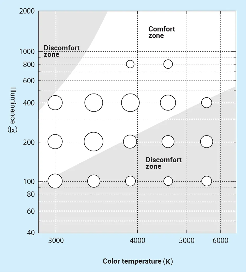
Figs. 1 and 2 show the results of this experiment compared with Kruithof’s results. Here, the larger the size of the circle, the more desirable the scene is perceived. The outline area shows Kruithof’s comfort zone, while the shaded area below shows the discomfort zone. For the evaluation of “socializing” shown in Fig. 1, the circle size is small when illuminance is 100 lx and large when illuminance is 400 lx. Within Kruithof’s comfort zone, the desirability level is generally “Cannot say either way” or higher; within the discomfort zone the desirability level is “Cannot say either way” or lower. Thus, the evaluation results are similar to Kruithof’s results.
For the evaluation of “relaxing” shown in Fig. 2, the combinations of illuminance and color temperature that exist in Kruithof’s discomfort zone are not especially desirable. This indicates that the results of both experiments are similar. Of the combinations of illuminance and color temperature that exist in Kruithof’s comfort zone, 800 lx lighting conditions are not especially desirable. This is the only point where the psychological evaluation results differ from Kruithof’s results.
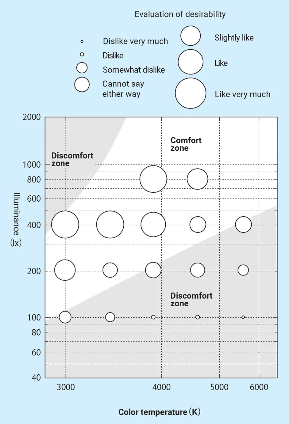
When the activity of daily living was socializing, the results of the psychological evaluations are very similar compared to Kruithof’s results; however, the results of the two experiments differed when the activity was relaxing. A major reason for this disparity was thought to be the differences in the required atmosphere for the various activities of daily living. In other words, while an informal, lively atmosphere is desirable for socializing, a tranquil, quiet atmosphere tends to be desirable for relaxing. Accordingly, it is surmised that people find high illuminance slightly undesirable when they are relaxing. That desirable illuminance and color temperature changes depending on the activity of the person using a certain lighting environment are a phenomenon that we experience on a daily basis.
As was made clear in the above-mentioned experiments and has also been reported by other researchers [4,5,6], it is possible for there to be cases in which the combination of illuminance and color temperature located within Kruithof’s comfort zone is not necessarily more comfortable than the combination of illuminance and color temperature located within the discomfort zone. Accordingly, if the most appropriate Illuminance and color temperature for designing a comfortable lighting environment are sought using Kruithof’s curve, there may be cases when the atmosphere is not very comfortable because of factors other than lighting, such as environmental conditions and activities of daily living. In particular, it is predicted that cases would also arise where the illuminance and color temperature values could not be accurately established in the areas close to the boundary between comfortable and uncomfortable.
However, Kruithof’s curve is convenient for explaining that low illuminance is comfortable when the color temperature is low, and high illuminance is comfortable when the color temperature is high. In this way, Kruithof’s curve is useful for qualitatively explaining the effects of Illuminance and color temperature on the atmosphere that people experience in daily life, and so it continues to be used today. Furthermore, the use of Kruithof’s curve is widespread amongst architectural designers, in particular, and sometimes becomes a point of discussion during the lighting planning stage. Moving forward, it would be desirable for a more detailed investigation to be carried out into what activities of daily living under what lighting environment configuration conditions, both outside and inside, Kruithof’s curve can be applied.
(3) Light color and sense of brightness
With regard to whether or not differences in light sour color have a psychological effect on sense of brightness, it has become clear that there is virtually no change in sense of brightness due to differences in light source color (color temperature/correlated color temperature) when the eyes are fully adjusted to the light source color 8)9). In cases where the sense of brightness is said to differ depending on differences in light source color, (a) it is necessary to check whether not only the light source color being compared but also the color-rendering properties are different, since the sense of brightness will naturally be different if the color-rendering properties are different; and (b) it is necessary to check whether the two light sources being compared are being observed and compared simultaneously, since color adaption will not be possible for either light source color if the two light sources are being compared simultaneously—in fact, a contracting effect will be created—and so in some cases the sense of brightness of the two light sources may differ.
4. Light color and how color is seen
In contrast to how light color is evaluated by looking directly at the light emitted by the light source, the color of objects is evaluated by shining the light emitted by the light source onto the object and then looking at the light reflected off the object. Thus, the light color is only related to the characteristics of the light emitted by the light source; however, how the color of the objects is seen is related to both the characteristics of the light emitted by the light source and the reflectance properties of the object being illuminated. It is necessary, therefore, to clearly distinguish between the light color and how the color is seen. Accordingly, it is not possible to determine the characteristics of how the color of an object is seen using the light source color. For example, even if the light source color has a reddish tinge, it is not necessarily the case that a red object can be made to appear red under this light source. This needs to be taken into consideration when selecting a light source.
(References)
*The information on this page was formatted on the basis of our company’s Japanese language website and revised in accordance with IEC standards; however, some items have been formatted in accordance with JIS standards for reference.
1) A.A.Kruithof Tubular luminescence lamps for general illuminaiton, Philips Tech. Rev.6 (1941) 65
2) Kanaya, S. and Kichise, H.: The effect of a lamp’s color temperature/color-rendering properties on the illuminance required indoors, National Technical Report, 23-4, pp. 58 (4 – 1957974 August)
3) Bodmann, H.W.:Quality of interior lighting based on luminance, Transactions of the IES. London, 3-1, PP.22-40 (1967)
4) Davis,R.G.andGinthner,D.N.:Correlated color temperature,Illuminance level,and the Kruith of curve,Journal of the Illuminating Engineering Society, PP.27-31 (1990)
5) Nakamura, H. and Karasawa, Y.:Relationship between Illuminance/color temperature and preference of atmosphere, Journal of Light & Visual Environment, 81-8A, pp. 69–76 (1997)
6) Kanaya, S. and Kichise, H.: The effect of a light source’s color temperature/color-rendering properties on required illuminance, Proceedings of the Annual Conference of the Illuminating Engineering Institute of Japan (1975), p. 48
7) Narisada, Kanaya, and Hashimoto: Color temperature/color-rendering properties of light sources and brightness, IEEJ Technical Meeting on Light Application and Visual Science, LAV-82-1 (8 1982)